Choosing tile is rarely about finding one “perfect” color. It is about building a visual relationship between floors, walls, cabinetry, lighting, and daily life. This guide explains how to match tile colors with interior decor without making the room feel staged or visually noisy.
Leatrice Eiseman, executive director of the Pantone Color Institute, has said, “Color is the visual component people remember about a brand.” Her point applies to interiors too. Tile often becomes the room’s lasting visual memory, especially in kitchens, bathrooms, and entryways. A warm ivory tile may soften walnut cabinets, while a cool gray tile can sharpen white furniture. Natural daylight changes these impressions throughout the day. Test samples near windows, under evening lamps, and beside permanent materials.
Small details matter.
This guide considers undertones, contrast, texture, grout, room size, and lighting. It also recognizes that design advice is not absolute. A blue-gray tile may look elegant in one home but strangely cold in another. Even a carefully chosen beige can appear pink beside red-toned wood. I have seen homeowners match tiles too closely, only to create a flat, unfinished result. Slight contrast usually adds depth, though too much contrast can fragment a small room.
The goal is not perfect coordination. It is a comfortable, intentional balance that still feels personal. Some choices may need reconsideration after installation. That is normal. By using physical samples, observing the room at different hours, and questioning first impressions, you can make more reliable decisions about color, proportion, and atmosphere.
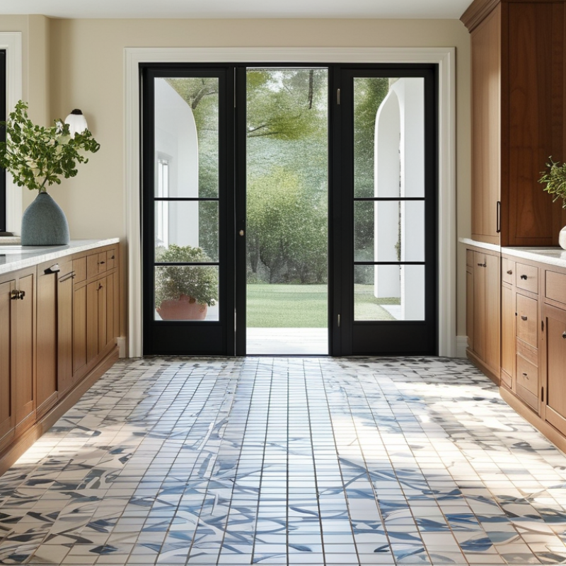
Tile color is not a decorative afterthought; it changes how a room feels and functions. Light, room size, and nearby surfaces all affect that effect. Warm beige tiles can soften north-facing rooms. Cool gray may make bright rooms feel calmer. White tile reflects light, but it can expose uneven grout and daily marks. Dark tile adds depth. It may also show dust quickly.
In practice, I compare tile samples beside cabinets, fabric, and painted walls. I view them in morning, afternoon, and artificial light. A color that looks balanced in a showroom may appear yellow at home. Undertones deserve careful attention. Green, pink, blue, or brown undertones can change the entire interior palette. Interior professionals often use larger samples because small pieces hide variation and texture.
I once chose a pale gray tile that seemed clean and modern. After installation, it felt colder than expected beside the white cabinetry. That mistake taught me to test the complete combination, not one surface alone. Grout color also affects the result. Matching grout creates a quieter surface, while contrast emphasizes each tile shape. For busy kitchens, slightly varied tones can conceal crumbs and minor marks. Still, too much variation may make a small room feel unsettled. Tile color should support the room’s use, natural light, and emotional character. It does not need to look perfect in isolation.
Room size changes how tile color behaves. In a compact bathroom, pale warm tiles can reflect light and make walls feel less enclosed. Large rooms can handle deeper shades without appearing crowded. However, very light tile may feel cold in a spacious, low-furnished room. I once chose a bright white sample for a narrow hallway, expecting openness. It looked sterile under the existing cool bulbs. My judgment needed more testing.
Lighting deserves attention at different times of day. Morning sunlight may reveal warm beige tones, while evening lamps can make gray tile look brown. Place large samples near windows, corners, and artificial lights. Observe them for at least one full day. Glossy surfaces bounce light and may emphasize uneven walls. Matte finishes soften reflections but can absorb brightness. Do not judge a sample against a clean white card alone.
Existing colors should guide the tile choice, not control it completely. Check cabinet wood, wall paint, metal fixtures, furniture, and nearby flooring. Choose one shared undertone, such as warm, cool, or neutral. A small tile sample beside reddish wood may expose unwanted green or blue hints. Grout also changes the result; high contrast makes the pattern more noticeable. Digital images can mislead. Physical samples remain essential. I still reconsider choices after installation plans change, especially when daylight, furnishings, and wall colors interact differently than expected.
Choosing a tile color scheme begins with the room’s decor style, not the tile display alone. Warm beige, terracotta, and muted olive suit natural, rustic, or Mediterranean interiors. Soft white, pale gray, and charcoal support contemporary rooms with clean furniture. Deep blue can add character, but it may feel heavy in a small bathroom. Test a sample beside cabinet wood, wall paint, metal fixtures, and daylight.
Professional data supports careful coordination. The 2024 U.S. Houzz Bathroom Trends Study reports that 84% of homeowners update shower areas during renovations, making wall tile a major visual decision. The National Kitchen & Bath Association’s 2024 Design Trends Report also identifies natural materials, warmer tones, and layered lighting as continuing influences. These findings suggest choosing tile colors that connect with existing textures, rather than following a temporary color trend.
Use one dominant tile color, one supporting shade, and a restrained accent. For example, warm ivory floor tile, sand-colored wall tile, and a small blue mosaic can create quiet coastal depth. Keep grout close to the tile for a seamless look, or choose contrast when the pattern deserves attention. I have found that samples often look darker beside glossy fixtures. Small details matter. Matte surfaces can soften bright rooms, although they may show marks more easily. Color planning is not perfectly predictable. Sunset light may change everything. Always inspect samples morning and evening before ordering.
Matching tile colors with interior decor starts with the walls. I usually place tile samples beside painted surfaces in morning and evening light. Warm white walls can soften beige, terracotta, or muted green tiles. Cool gray walls may suit blue-gray, charcoal, or crisp white tile. Strong contrast can look attractive, but it may make a small room feel divided.
Furniture should repeat one tile color without copying it exactly. For example, a walnut cabinet can balance sandy tiles and cream walls. A pale sofa may need darker floor tiles for visual weight. Keep the undertones consistent. Yellow-beige tile beside pink-beige fabric can appear unexpectedly muddy. I once approved samples under bright showroom lights, and the bathroom looked much darker at home. That mistake changed my process.
Fixtures also influence the palette. Brushed metal can support cool neutrals, while aged brass works naturally with warmer tiles. Black fixtures create sharper edges, especially against light walls. Use grout as part of the color plan. Matching grout makes the surface look calm, while contrasting grout emphasizes each tile shape. Test a full sample board with tile, grout, wall paint, cabinet material, and fixture finishes. Small samples can mislead. Real scale matters. If the combination feels almost right but not comfortable, wait one day and inspect it again.
| Room or Zone | Recommended Tile Color | Wall Color Direction | Furniture and Cabinet Pairing | Fixture and Hardware Finish | Grout Color | Lighting Consideration | Design Effect |
|---|---|---|---|---|---|---|---|
| Small Bathroom | Soft white, pale beige, or light gray | Use a wall color that is equal to or slightly lighter than the tile | Light wood, white cabinetry, or minimal gray storage | Chrome, brushed nickel, or matte black | White or light gray for a continuous appearance | Cool white light can emphasize blue-gray tones; warm light softens beige | Bright, open, and visually spacious |
| Kitchen Backsplash | Warm white, cream, muted green, or light blue | Choose a neutral wall tone that supports the cabinet color | White, natural oak, walnut, or painted sage cabinetry | Coordinate with the dominant metal already used in the kitchen | Matching grout creates calm; contrasting grout highlights the pattern | Under-cabinet lighting may make warm tiles appear more yellow | Connected, practical, and easy to coordinate |
| Living Room Floor | Greige, warm gray, limestone, or natural terracotta | Select muted neutrals with a similar undertone | Textured upholstery, natural wood, woven fabrics, and leather | Aged brass, bronze, black, or brushed steel | Use a grout close to the tile to reduce visible joints | Large windows reveal undertones; test samples in daylight | Grounded, comfortable, and adaptable |
| Entryway | Medium gray, charcoal, taupe, or patterned neutral | Soft white, warm gray, or a restrained color pulled from the tile | Dark wood, black console furniture, or durable woven pieces | Black, dark bronze, or satin nickel | Medium gray or taupe helps disguise everyday dirt | Limited daylight can make dark tile feel heavier; use layered lighting | Durable, welcoming, and visually defined |
| Bedroom Accent Wall | Dusty blue, muted green, warm clay, or soft charcoal | Keep surrounding walls lighter and less saturated | Upholstered bed, light oak, rattan, or understated painted furniture | Warm brass, aged bronze, or matte black depending on the tile undertone | Use a related neutral to keep the accent from appearing too busy | Warm lamps enhance clay and beige; daylight clarifies blue and green | Calm, layered, and restful |
| Shower or Wet Room | Blue-gray, sea green, white, or sandy beige | Use a low-contrast neutral or a lighter version of the tile color | Simple white, pale wood, or stone-look vanity finishes | Brushed nickel, chrome, or brushed brass | A medium-value grout can balance maintenance and visual contrast | Glossy surfaces reflect light; matte surfaces produce a softer effect | Fresh, spa-like, and cohesive |
| Outdoor Patio | Sand, warm gray, terracotta, or natural stone tones | Coordinate with exterior paint, masonry, and surrounding landscape | Teak-look wood, neutral outdoor textiles, and woven furniture | Black, bronze, galvanized steel, or natural wood | A mid-tone grout can reduce the appearance of outdoor dust | Sunlight intensifies color; review samples outdoors before installation | Natural, relaxed, and connected to the landscape |
| Laundry or Utility Room | Light gray, white, pale blue, or soft sage | Clean white or a light neutral with a compatible undertone | White, gray, or light wood cabinets with simple open shelving | Brushed nickel, stainless steel, or matte black | Light gray offers a practical balance between brightness and upkeep | Bright, neutral lighting supports accurate color evaluation | Clean, organized, and functional |
Review tile samples in the room where they will be installed. Store lighting can distort beige, gray, and green undertones. Morning light may reveal warmth that evening lamps hide.
The 2024 U.S. Kitchen Trends Study surveyed more than 1,300 homeowners about renovation choices. Its findings show that durable, easy-care surfaces remain strong priorities. Use that evidence practically: place samples beside cabinets, flooring, worktops, and painted walls. Check them at three times daily. Daylight matters most.
Test at least three tile sizes. Large tiles can calm a busy room, while small tiles add rhythm. Keep the grout sample beside the tile. It can change the entire balance. A pale tile with dark grout may look patterned, not peaceful. Too much contrast fails.
Aim for one dominant color, one supporting tone, and a restrained accent. A 60-30-10 balance is useful, but it is not a law. Real rooms contain reflections, timber grain, metal, and shadows. The National Kitchen & Bath Association’s 2024 Design Trends Report also identifies natural materials and warmer neutrals as continuing design interests. I would still question a purely beige scheme. It may feel safe, yet flat under cloudy light. Photograph each sample beside the largest fixed surface, then review the images before ordering. A small mistake repeated across a wall becomes expensive.
: Start with the room’s decor style. Warm beige, terracotta, and muted olive suit rustic or Mediterranean interiors. Soft white, pale gray, and charcoal fit contemporary spaces. Test samples before ordering.
Light colors can make small bathrooms feel more open. Deep blue adds character but may feel visually heavy. Use it sparingly, perhaps as a small accent mosaic.
Use one dominant color, one supporting shade, and one restrained accent. For example, combine ivory floor tiles, sand-colored wall tiles, and a small blue mosaic.
Matching grout creates a calm, seamless surface. Contrasting grout highlights each tile shape. Choose contrast only when the pattern deserves attention.
Warm white walls soften beige, terracotta, and muted green tiles. Cool gray walls suit blue-gray, charcoal, or crisp white tiles. Strong contrast can divide a small room visually.
Repeat one tile color through furniture without copying it exactly. Walnut cabinets balance sandy tiles and cream walls. Aged brass supports warmer tones, while black fixtures create sharper edges.
Daylight, showroom lighting, and sunset can change the color dramatically. Inspect samples in the morning and evening. Glossy fixtures may make samples appear darker.
Approving samples under bright showroom lights can create surprises at home. I made that mistake once. Test a full board with tile, grout, paint, cabinet material, and fixtures.
Matte surfaces can soften bright rooms. However, they may show marks more easily. Consider cleaning habits before choosing them.
Wait one day before deciding. Inspect the samples again in changing light. Color planning is not perfectly predictable.
Learning how to match tile colors with interior decor begins with understanding how tiles influence the mood, balance, and visual flow of a room. Consider the room’s size, natural and artificial lighting, and existing colors before making a selection. Light, neutral tiles can make compact spaces feel more open, while deeper tones may add warmth and character to larger areas. The chosen color scheme should also reflect the overall decorating style, whether it is minimalist, traditional, contemporary, or rustic.
To create a cohesive result, coordinate tile colors with the walls, furniture, cabinetry, fixtures, and other permanent features. Look for shared undertones, such as warm beige with cream or cool gray with soft blue, instead of matching every element exactly. Before finalizing, review physical tile samples in the actual room at different times of day. Comparing these samples with fabrics, paint, and finishes will help you achieve a balanced combination that feels intentional, comfortable, and visually consistent.
Rock Stone